
Dashboard
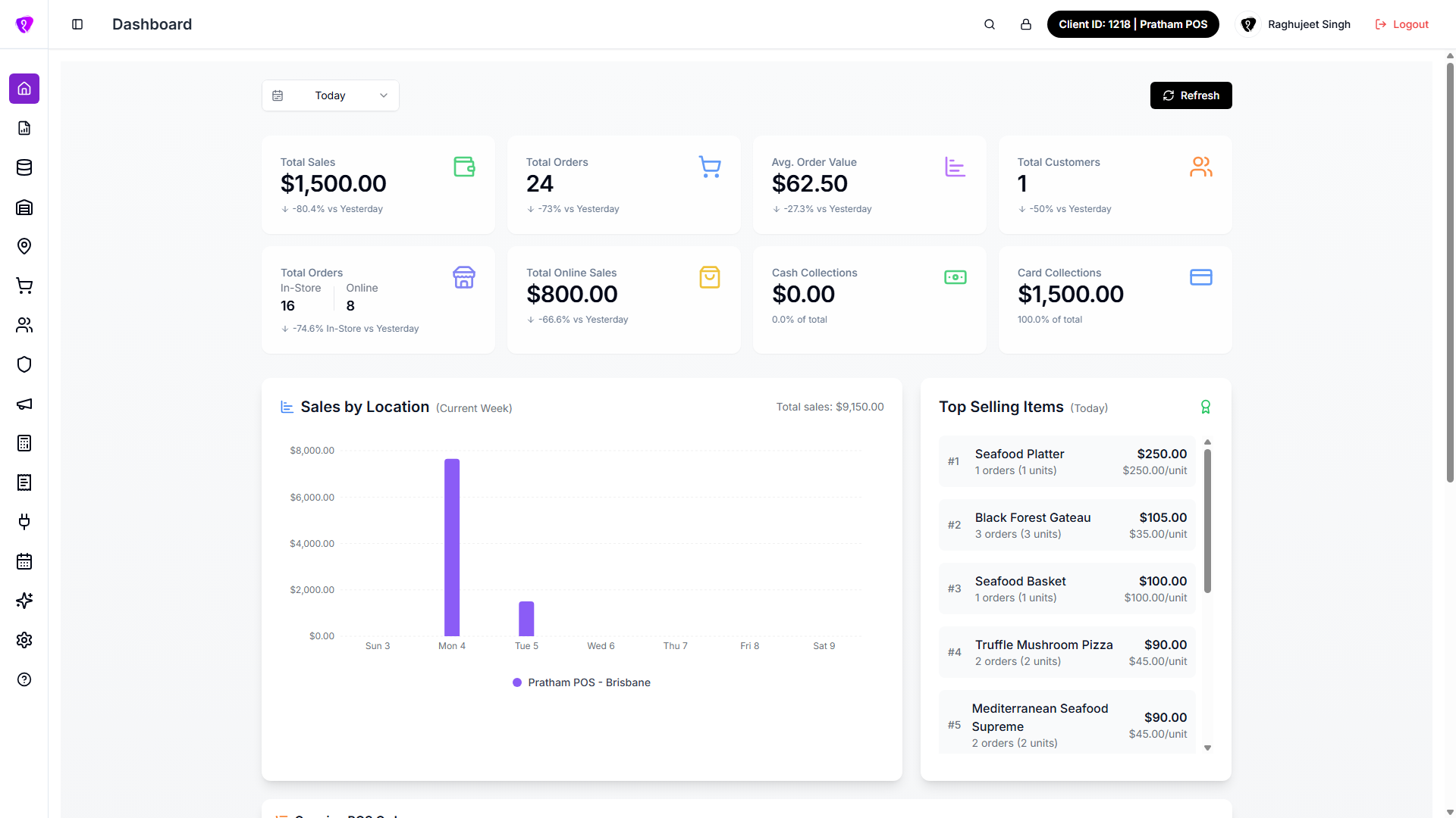
The Dashboard is the home screen after sign-in. It shows sales, orders, customers, charts, and live POS orders for the time period you pick.
Open the screen: Sidebar → Dashboard (or go to / after login)
Do you land somewhere else after login?
Your role must include Admin Dashboards permission to see this page. If you do not have access, the app opens the first screen you are allowed to use instead.
Change the date period
What it does
Updates every metric, chart, and list on the Dashboard to match the dates you select.
Step-by-step
- At the top of the Dashboard, find the date dropdown (calendar icon).
- Select a preset period - for example Today, Yesterday, Current Week, This Month, or This Year.
- Wait a moment while the numbers and charts reload. You may see a short message that data is refreshing.
- To use your own dates, select Custom Range.
- Tap the date button that appears (for example Pick a date range).
- Select a start date and end date in the calendar, then confirm.
- Read the confirmation message showing the range you picked.
| Preset option | What it shows |
|---|---|
| Today | Current day (default when you open the Dashboard) |
| Yesterday | Previous day |
| Current Week | This calendar week |
| Last Week | Previous calendar week |
| This Month | Current calendar month |
| Last Month | Previous calendar month |
| This Year | Current calendar year |
| Last Year | Previous calendar year |
| Custom Range | Any start and end date you choose |
Comparison labels
Many cards show a percentage change with text like vs Last Period - that compares to the previous matching period (for example yesterday vs the day before).
Common mistakes / FAQs
- Charts say “No data available”. Try a wider date range or tap Refresh.
- Custom range did not apply. Select both start and end dates, then confirm the picker.
Refresh the dashboard
What it does
Reloads the latest figures from the server and refreshes your menu permissions.
Step-by-step
- Tap Refresh at the top right of the Dashboard.
- Wait while the button shows Refreshing… with a spinner.
- When it finishes, all cards and charts show updated data.
When to refresh
Use Refresh after a busy service period, or if numbers look stale compared to POS activity.
Summary cards
What it does
The top rows show headline numbers for the selected date period. Some cards open a related screen when you tap them.
First row
| Card | What it shows | Tap to open |
|---|---|---|
| Total Sales | Revenue for the period, with up/down trend | Sales report |
| Total Orders | Order count for the period, with trend | Transactions |
| Avg. Order Value | Average spend per order, with trend | - (view only) |
| Total Customers | Customer count for the period, with trend | Customers |
Second row
| Card | What it shows | Tap to open |
|---|---|---|
| Total Orders (In-Store / Online) | Order split between in-store and online, with in-store trend | Transactions |
| Total Online Sales | Online revenue for the period, with trend | - (view only) |
| Cash Collections | Cash payments collected, with % of cash + card total | Cash / Card report |
| Card Collections | Card payments collected, with % of cash + card total | Cash / Card report |
Loading state
While data is loading, cards may show - instead of a number. Wait for loading to finish or tap Refresh.
Sales by Location chart
What it does
Bar chart of sales by outlet (location) for the selected period. Each colour is a different location.
Step-by-step
- Scroll to Sales by Location.
- Read the period name beside the title (for example the week or month you selected).
- Check Total sales shown on the right.
- Hover or tap a bar to see each location’s amount for that day or bucket.
- Use the colour legend below the chart to match bars to location names.
Common mistakes / FAQs
- A location is missing from the chart. It may have zero sales in this period - hover the bar area to check all locations in the tooltip.
- Chart is empty. Change the date period or tap Refresh.
Top Selling Items
What it does
Ranked list of your best-selling products for the selected period - orders, units sold, total revenue, and average price per unit.
Step-by-step
- Find the Top Selling Items panel on the right side of the chart row.
- Read the period name in the title.
- Scroll the list if there are many items.
- Each row shows rank (#1, #2, …), item name, order count, units, total amount, and price per unit.
Common mistakes / FAQs
- List says “No data available”. Try a different date range - very quiet periods may have no ranked items yet.
Ongoing POS Orders
What it does
Live snapshot of active orders still in progress on POS - not completed or cancelled yet.
Step-by-step
- Scroll to Ongoing POS Orders.
- Read the X Active badge for the total count.
- Optionally select All Platforms or one platform from the dropdown to filter.
- Read the table columns: Order ID, Location, Platform, Status, Time, Amount, Attendant.
- If more than five orders exist, tap View all X orders to open Transactions.
| Status colour (examples) | Meaning |
|---|---|
| Green | Ready or completed-style active states |
| Yellow | Placed, preparing, or in progress |
| Red | Cancelled |
Shows up to five rows
The table lists the first five active orders. Use View all for the full list on Transactions.
Period overview and hourly sales
What it does
Bottom section summarises online vs in-store activity and shows hourly sales across the day.
Step-by-step
- Scroll to the overview card titled with your period name (for example Today's Overview).
- Read the three summary tiles:
- Online Orders
- In-Store Orders
- Online Sales
- Below that, open Hourly Sales Distribution.
- Read Peak hour on the right - the busiest hour and sales amount.
- Use the area chart to see when sales were highest through the day (12 AM through 11 PM).
Common mistakes / FAQs
- Hourly chart says “No data available”. No sales were recorded for this period, or data is still loading.
- Peak hour missing. Not enough hourly data for the selected range.
Permissions
| What you need | Why |
|---|---|
| Admin Dashboards module permission | See Dashboard in the sidebar and open the home page |
| READ on Admin Dashboards | View dashboard metrics and charts |
Cards that link to Reports, Transactions, or Customers also need permission on those screens. If a link opens Access denied, ask your administrator to adjust your role.
If the Dashboard looks wrong
Step-by-step
- Check your internet connection.
- Select Today (or a known busy period) from the date dropdown.
- Tap Refresh.
- If cards stay empty or show errors, note the time and any message on screen.
- Open Help & Support from the sidebar or contact your administrator.